5 Home Page Features Every Service-Based Business Needs
Your website's home page is more than just a welcome mat, it's where visitors get their first glimpse of you and what you do. If you're just starting out, no worries. Here are five common mistakes and five essentials to help you design a home page that feels professional, polished, and uniquely yours.
5 Common Mistakes
1. No Clear Call-to-Action (CTA)
Your homepage should guide visitors on what to do next, whether that's booking a call, browsing your services, or joining your email list. If there's no clear direction, people will leave without taking action.
2. Too Much (or Too Little) Information
A cluttered homepage overwhelms visitors, while a bare homepage doesn't give enough context. Strike a balance by including just the right amount of key information without overload.
3. No Visual Hierarchy
If everything on your homepage demands attention, nothing stands out. Use intentional layout, spacing, and font sizes to highlight the most important sections.
4. Slow Load Time & Mobile Unfriendliness
If your homepage takes forever to load or isn't optimized for mobile, visitors will bounce. Make sure your images are compressed and your design works seamlessly on all devices.
5. No Personality or Brand Story
Your homepage should instantly tell visitors who you are and why they should care. A generic or impersonal homepage won't create a lasting impression, let your voice shine.
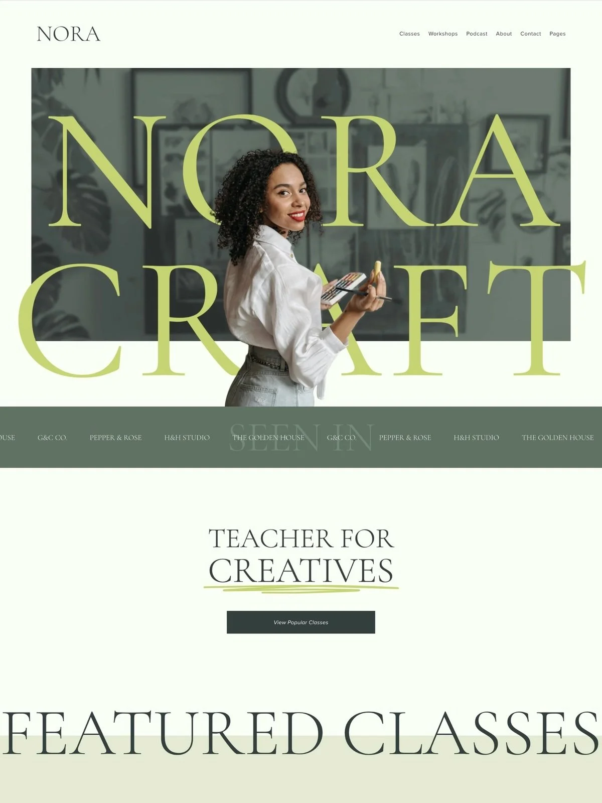
5 Essential Homepage Features
1. A Clear and Confident Headline
Your headline is your hello. It doesn't need to be fancy, just make sure it reflects what you're all about. Something like, "Strategy-First Nutrition Coaching" or "Interiors Designed Around How You Live."
2. Your Work Front and Center
Show off what you do. Even if it's a small selection, high-quality images of your space, your services, or your results let visitors see your style and what it's like to work with you.
3. Easy Navigation for the Win
Keep your menu simple and clear, think Services, About, and Contact. It's okay if your site doesn't have a lot of pages yet, starting with the basics helps visitors focus on what matters most.
4. Calls-to-Action That Guide Next Steps
Invite visitors to connect with you. Whether it's "Book a Consult" or "See My Work," use friendly, encouraging CTAs to direct people toward working with you or learning more.
5. A Personal Touch
You may not have testimonials yet, but your story is powerful. Use a section to share a bit about your journey, what drives your work or why you started your business. A photo of you in your space can make the page feel warm and approachable.
Ready to Make Your Mark?
Your website doesn't have to feel overwhelming. Start with the essentials and let your voice shine.
Ready to Make Your Mark?
Your website doesn't have to feel overwhelming. Start with the essentials, or skip the guesswork entirely with a template that's already done for you.